Font Styles
Choosing the fonts styles for our title and opening credits was mainly my job. Originally when researching I thought Helvetica would be the most effective font to use, but after putting it in I realized that it was not dramatic enough for the theme of our movie, especially considering it appears onscreen directly after a sound bridge of Jenna screaming.

I ended up choosing Footlight MT as a font, because it provides a more dramatic and creepy effect. However, we still incorporated a white font against a black screen, which is what was the most similar to all the films I have researched.

For our opening credits, I decided to go with the font Copperplate, in burgundy with black outlining because it shows up clearly and goes with our films serious and eery tone.
Effects
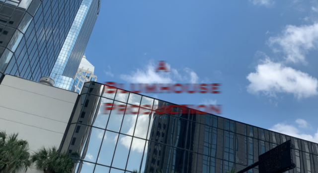
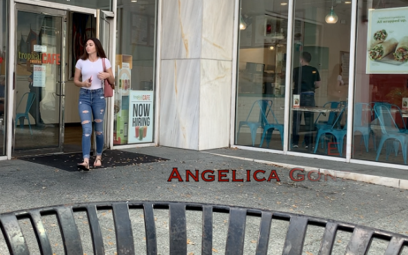
We did not want our titles to just appear on the screen and go away. Every aspect of a movie should do its best to communicate the overall tone, so we wanted a unique effect that would match or creepy mood. For the credit to our production company in the establishing shot of our film, we had inserted the effect. Because it is the first thing viewers see, this automatically makes them aware of our films genre. The rest of the opening credits in our movie, we used the slip effect, which makes the title slowly fade out. All our clips are a little slowed down in order to build up suspense leading up to the kidnapping scene, so this slow fading away of the title is perfectly in sync.
Transitions
We did not use many transitions when filming because we both believed that iMovie transitions would make the film appear cheap. The only transition we ended up using was a fade to black right after Jenna’s terrifying scream, because this hardly noticeable transition helps the flow of our movie and does an excellent job of presenting the title.
Sources:
http://mentalfloss.com/article/21028/5-film-transitions-worth-knowing
